Email Design 101: How to Design an Email That Drives Action

The big moment is finally here.
After crafting and recrafting your email, your finger lowers onto your mouse. With a triumphant click, you’ve sent your email.
Then, you wait.
And wait. And wait some more. Nothing happens. No one buys your product, registers for your event, or donates to your nonprofit.
Your marketing email has gone out into the void, getting a few opens and clicks but driving no substantial action.
What went wrong?
One of the biggest reasons for underperforming emails is weak email design.
Unlike a typical email, like the kind you send to friends or family, a marketing email should be designed to push the reader to take a specific action that benefits your business in a measurable way.
Tip: A well-designed email is only as successful as the planning behind it. If you’re sending emails without a planned email marketing strategy, take some time to develop a strategy first.
To create a marketing email that successfully drives action, follow these seven essential elements of email design.
1. Header

The first thing to include in your email is a well-crafted header. Your header contains the From line, the Reply line, and the Subject line
For the From line, use a recognizable name so those receiving your email instantly know who it’s coming from. Just like a piece of postal mail, the sender plays an important role in persuading your readers to open your email.
For the Reply line, use an official email address from your company that will be monitored so you’ll see any responses come through.
For the Subject line, ideally, keep it between four to seven words. This offers the best readability on a mobile device.
The subject line should explain what your email is all about in a quick, eye-catching, and entertaining way.
Tip: Here are 11 surefire secrets to standout subject lines.
2. Preheader
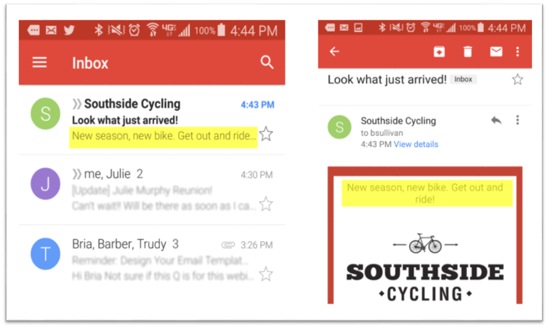
The preheader acts like the second subject line when reading on a mobile device, enticing people to open your email. The first five to eight words of your email become the preheader, giving readers a better idea of what the email is about.Here’s how the preheader looks in a subscriber’s mobile inbox:

3. Logo and colors
After the header and preheader, reinforce your brand by placing your logo at the top and incorporating your brand colors.If your logo and colors stay consistent, your subscribers will begin to instantly recognize your brand and email style.
Your email colors should match the ones you use on your website, and the logo should be the same one that your business always uses. Make sure that when readers click your logo, they are directed to your website.
4. Image
Next, include an attention-grabbing image that pulls the reader down into the next section.The image should relate to the content of the email, and be at least 600 pixels wide. When clicked, the reader should be linked to the same destination that your call-to-action directs to.
5. Text
Below your image, you should write your email content. Start with a strong headline to draw attention to your message.Use dark text on a light background for maximum readability, and make your headline larger than the body text (around 22 pts.)
In the message body, we recommend using 14 pt text that is either aligned left or centered. If you use more than three sentences, you should left align.

The body copy should quickly build up to the Call-to-Action. Make it clear why the reader should act, how they can do it, and how it will benefit them.
6. Call-to-Action
The Call-to-Action (CTA) button highlights the action you want the reader to take.You may want your reader to visit a specific page on your website, make a donation, or redeem a coupon.
Make the CTA stand out by using large button text to stop the reader, clearly stating where they will be directed when they click it.

What if you want to include more than one call-to-action?
If need be, you can include up to three CTAs. However, pushing your audience to action requires simplicity. The more options you give, the less chance you have of getting them where you want.
However, for some industries — like Real Estate — it might make sense to highlight a few items in a single mailing.

If you’re tempted to put a ton of different calls-to-actions in your email, it’s likely that you aren’t sending emails frequently enough or tailoring your emails to a specific enough audience.
7. Footer
The final element of your email design, the footer, shows readers how to connect with you.Your footer is the stamp of useful information at the bottom of your email that contains contact information, including your email, location, phone number, and links to your social media pages.

Set it and forget it. The footer should be the same in all emails that your send.
Is your email design as strong as it needs to be?
Use this email design checklist to stay on track.If you follow these steps, you won’t just create an email that looks good; you’ll create one that achieves measurable results for your business.
Each element of your email design should capture attention and push the reader forward until they reach the CTA and take action.
Hint: Once you make your first email that follows the seven elements of email design, save it as a draft to create a reusable template. This will give you a starting place for future emails.
Comments
Post a Comment