How to Create Mobile-Friendly Emails that Inspire Action

Boloco is a business that knows a thing or two about inspiration.
From their globally inspired menu, to their commitment to delight and inspire every customer that walks through their doors, inspiration is a major part of what made this East Coast burrito chain success.
Boloco also knows exactly how to inspire action from their email marketing, as well.
As a long-time Constant Contact customer, Boloco has been using email marketing to build relationships with their target audience for more than a decade. And while plenty has changed since they sent their first email, their ability to move with the times and deliver a quality experience to customers online and off, should be an inspiration to other businesses and organizations.
Inspiring action in a mobile world
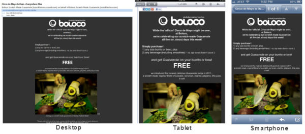
One of the best ways Boloco continues to inspire action is by making sure their emails look great no matter what type of screen their readers are using.With more than 43% of all emails now being read on smartphones and tablets, creating mobile-friendly emails can have a major impact on your email marketing strategy.
What exactly is a mobile-friendly email?
A mobile-friendly email is an email that displays optimally between a desktop/laptop and a mobile device. Simply put, a mobile-friendly email is an email that looks great no matter what type of device the recipient is using.
If you haven’t started thinking about creating mobile-friendly emails of your own, now is a great time to do it. Let’s take a look at how Boloco put their strategy into action.
1. Start with a single-column template
Because of the limited real estate you get with a mobile device, it’s generally better to use simple layouts. Multi-column layouts (2 columns or more) often require readers to zoom or scroll on their smartphone to see the entire message.When I received Boloco’s latest email, I was waiting in line at Dunkin Donuts checking email on my phone. Your readers may be seated in meetings, walking down the street, or standing on the sidelines at their kid’s Little League game.
Don’t make them search for the information they want, keep it simple with a single-column template.
2. Use a single, clear call-to-action
All it takes is a visit to Boloco’s Facebook or Twitter Page to realize that this East Coast Burrito chain has a lot going on. But, I’m sure you do too.Here’s the thing, emails jam-packed with information just don’t work on a mobile device. Neither do emails with multiple calls-to-action.
Instead, focus on one action you want your readers to take.
For Boloco, that action was to visit their restaurants and take advantage of this great offer. For you, it may be to shop online, register for your event, visit your blog, or call to make a reservation.
Before you start to create your email content, decide on the action you want your reader to take.
3. Rank your information and format accordingly
When a reader glances at your email, they should know right away what information is the most important, what they should look at next, and what’s the least important.One of the ways you can do this is by ordering the information in your email accordingly. The other way is to format your content in a way that simply makes sense for the reader.
Again, let’s look to Boloco’s latest email. This time, let’s check it out on a tablet.
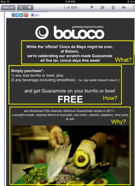
This email can be broken down into three simple sections:
- What: A special offer at Boloco
- How: Simple steps for how to redeem the offer
- Why: An explanation of why you might want to check it out
- What: Bolded and positioned in the top, center of the screen.
- How: Presented in a numbered list. Lists are quick and easy to read.
- Why: Italicized and accompanied with a beautiful looking photo.
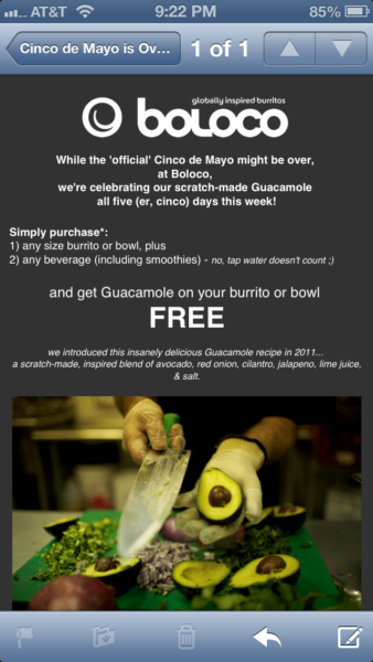
4. Put your most important information above the fold
While “above of the fold” is usually reserved for print publications, the same logic also applies to designing mobile-friendly emails.Here’s what Boloco’s latest email looked like when it got to my inbox:

Notice how the most important information is visible without having to swipe the screen with my finger? That’s what a great mobile experience looks like!
5. Brand your email
Your readers have always made quick decisions about which emails they decide to read. Thanks to mobile, those snap decisions are being made faster than ever before.You’ve picked the right template, created a great offer, and formatted your content in a way that’s easy for your readers to consume and act upon. Don’t hit send without adding the branding that your target audience already knows and trusts.
Follow Boloco’s lead; put your logo at the top of every email you send.
Inspired? It’s time to take action!
In the last two years, the number of people accessing emails on mobile has increased by 330%. In that same period of time, the number of emails on desktop has dropped by 44%.58% of marketers believe that smartphones and tablets will have the greatest impact on email over the next year, even ahead of social media.
If numbers don’t inspire you this will. People sign up for your emails because they trust that you’ll deliver something of value. Part of that value comes from the type of content you provide. The other part comes from the experience you offer. Providing a mobile-friendly experience is no different than providing a positive experience at your place of business.
Your customers’ email habits are changing and so should yours. Follow Boloco’s lead and put your own mobile email strategy into action!


Comments
Post a Comment