How to Find Mobile-Friendly Email Templates

Not sure if your customers are reading your emails on a mobile device?
There’s a good chance they are.
The average person looks at their phone 150 times a day and 53 percent of email is opened on a mobile device.
If you want to get the most out of your email marketing, make sure you’re using the right email template. With Constant Contact, you have access to several mobile-friendly email templates.
To find them simply search by type and choose mobile friendly.
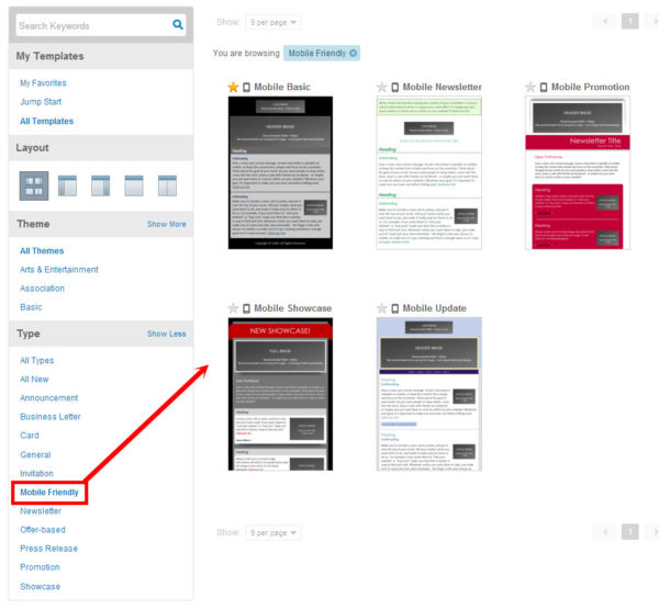
The benefit of using the right template
A mobile-friendly template uses a single-column design, automatically re-sizes images for mobile, has a default font size that’s optimal for mobile readers, and utilizes a layout that’s built for a clear and concise message.If you prefer to use the regular templates, you can still create mobile-friendly emails. Just make sure you’re using a single-column template because it’s easier to read on a smartphone. Emails with multi-column layouts are hard to navigate on a small screen.
Also, try to keep your content short too so your readers don’t have to scroll through a long message to find your call to action. Using at least an 14 point font for body text and 22 point for your article headlines is ideal for mobile.
This example from AwesomeMerchandise.com follows all of those rules:


Comments
Post a Comment