How to Make the Change to a Mobile-Friendly Email

We all know that change can be difficult.
It’s true in life and it’s certainly true when it comes to marketing your business or organization.
You find something that works, you invest time, energy, and resources into improving it, and then one day someone tells you stop and rethink everything that you’ve been doing.
It can be frustrating to say the least.
And while you might not be thrilled at the prospect of having to rethink your marketing strategy again, if you’re not at least considering making the switch to mobile-friendly emails you could be missing out on new opportunities to grow.
Wanting your email to look good everywhere is by no means a new idea.
But what has changed, is the number of places your emails are being seen by your readers. With 43 percent of emails being opened on a smartphone or tablet, making sure your email looks good no matter where it’s being read has taken on a whole new meaning.
That’s why we decided to make the change to a mobile-friendly email.
Here’s a closer look at how we did it.
But what we quickly found, when we viewed our own emails on a smartphone, was that using multiple columns was actually doing more harm than good. While the content may have appeared more organized on a desktop monitor, on a smartphone it was difficult to read without zooming in.
If you’ve ever had to zoom in to read something on a smartphone or tablet, you know it’s not ideal. Instead, we decided to use a single-column template.
The way our readers’ were accessing information was changing. Whether they were reading on a mobile device or not, we knew they wouldn’t want lengthy emails jam-packed with multiple articles and too many calls-to-action.
Today, convenience and instant access has become the trademark of a positive online experience.
For us, that meant focusing on the content that was most important and cutting out articles and calls-to-action that could detract from the goal of our email.
Because the majority of our content was available inside the newsletter, open rates were our primary gauge of success. As we began to limit the amount of content we put into the actual email and instead linked to our blog or website to read more, we began to take a close look at the type of action people were taking away from the inbox.
We discovered we needed to make it as easy as possible to click-through from our emails. We learned a number of important lessons in the process:

But once we decided a change was needed, taking control of our fonts proved to be a small step toward helping us achieve big results.

Here are a couple of things to keep in mind:
With a new and improved template, we began to rethink our content as well. (Remember: clear, concise, and easy to consume is the type of experience that works well on mobile.)
With a more focused content strategy, we switched our focus to driving people to our blog and website, rather than packing everything into a single email. This made it easier for people to take the next step.
And finally, we took control of our fonts and made sure our emails were easy-to-read no matter what type of screen our audience was using.
What are you doing to help make the change to mobile-friendly emails? Let us know in the comments below.
It’s true in life and it’s certainly true when it comes to marketing your business or organization.
You find something that works, you invest time, energy, and resources into improving it, and then one day someone tells you stop and rethink everything that you’ve been doing.
It can be frustrating to say the least.
But we all know that change can be a good thing as well.
Most likely, you’ve made some pretty significant changes in the way you market your business already.And while you might not be thrilled at the prospect of having to rethink your marketing strategy again, if you’re not at least considering making the switch to mobile-friendly emails you could be missing out on new opportunities to grow.
Back in 2012, we were faced with a very similar reality when we decided to rethink our CTCTSocial newsletter.
“With so many people consuming email across multiple devices these days—desktops, tablets, smartphones—it’s really important that your emails look great everywhere,” explains Dave Charest, Content Manager at Constant Contact. “It’s also important that the emails are focused and concise in both content and design.”Wanting your email to look good everywhere is by no means a new idea.
But what has changed, is the number of places your emails are being seen by your readers. With 43 percent of emails being opened on a smartphone or tablet, making sure your email looks good no matter where it’s being read has taken on a whole new meaning.
That’s why we decided to make the change to a mobile-friendly email.
Here’s a closer look at how we did it.
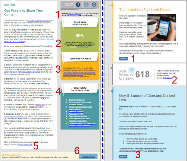
1. We started with our email template
When we created the original CTCTSocial newsletter, we used a double-column template. We were offering up a lot of great content and didn’t want readers to have to scroll through multiple pages to read it.But what we quickly found, when we viewed our own emails on a smartphone, was that using multiple columns was actually doing more harm than good. While the content may have appeared more organized on a desktop monitor, on a smartphone it was difficult to read without zooming in.
If you’ve ever had to zoom in to read something on a smartphone or tablet, you know it’s not ideal. Instead, we decided to use a single-column template.

2. Cutting down content
Once we decided to use a single-column template, we knew the way we approached our content had to change too.The way our readers’ were accessing information was changing. Whether they were reading on a mobile device or not, we knew they wouldn’t want lengthy emails jam-packed with multiple articles and too many calls-to-action.
Today, convenience and instant access has become the trademark of a positive online experience.
For us, that meant focusing on the content that was most important and cutting out articles and calls-to-action that could detract from the goal of our email.
3. Rethinking links
As our new approach to content began to take shape, we knew that links would play a more important role in our redesigned newsletter.Because the majority of our content was available inside the newsletter, open rates were our primary gauge of success. As we began to limit the amount of content we put into the actual email and instead linked to our blog or website to read more, we began to take a close look at the type of action people were taking away from the inbox.
We discovered we needed to make it as easy as possible to click-through from our emails. We learned a number of important lessons in the process:
- For starters, buttons work much better than links on a mobile device. While traditional links are still important, using a button to read more, register now, or signup today is a much better experience for your mobile users.
- Also, stacked links are extremely difficult to click with the tip of your finger. Links need room to breathe, especially on a mobile device. If you’re making it hard for someone to click your links, you could be missing out on traffic, signups, and even sales.
4. Taking control of our fonts
One of the things that surprised me the most when looking back at the original CTCTSocial layout was the sizes of fonts that were used. With so much to say and so little space to fit, using fonts that looked good on mobile was no easy task.But once we decided a change was needed, taking control of our fonts proved to be a small step toward helping us achieve big results.
Here are a couple of things to keep in mind:
- Use a minimum of size 11pt font for body text and 22pt for headlines.
- Use a strong contrast of colors, like dark text on a light background.
To recap
We started with picking the right template. What may have been a big change, proved to be just what we needed to simplify our email layout.With a new and improved template, we began to rethink our content as well. (Remember: clear, concise, and easy to consume is the type of experience that works well on mobile.)
With a more focused content strategy, we switched our focus to driving people to our blog and website, rather than packing everything into a single email. This made it easier for people to take the next step.
And finally, we took control of our fonts and made sure our emails were easy-to-read no matter what type of screen our audience was using.
What are you doing to help make the change to mobile-friendly emails? Let us know in the comments below.


Comments
Post a Comment